Our fresh new look is officially live and on full display, marking the next phase of Breadcrumb.
The rebrand heralds a new phase of growth. We’re seeing significant traction in our biggest market yet, the US, and are introducing product features with huge potential, such as our recent AI functionality.
You might notice something else, too. We’ve dropped the “1” from our name. It’s simpler… and let’s be honest, it’s what most of you were calling us anyway.
Why did Breadcrumb rebrand?
Breadcrumb started as a simple contact tracing tool that has now evolved into a site safety solution used by over 1 million workers globally.
A lot has changed since 2020.
- Our London-based office almost doubled in size as a direct response to increasing demand for our safety tool on UK and Ireland construction sites.
- We joined forces with our Australian competitor, SignOnSite, bringing in significant new talent and accelerating product development. This brought about the launch of our in-house Innovation Hub which produced Breadcrumb’s AI Safety Sidekick in August.
- We officially launched in the US with "boots on the ground" and opened a San Francisco office to support our growing team in the biggest market we’ve serviced yet.
We had new people operating in new markets with lots of new ideas and we wanted a visual identity and voice that would reflect that, bridging the gap between who we were and where we see ourselves now - an innovative safety tool tackling some of the biggest challenges faced on the worksite today.
“We’ve grown up, and so has our brand. This new identity reflects who we are today as a unified, global company that is trusted, and built for everyone on site, from director to the site worker.” ~ Simon Elliott, Breadcrumb CEO
What’s with the name?

Like every piece of serious software, our name was inspired by a fairytale.
Breadcrumb is based on the story of Hansel and Gretel, who famously left a trail of breadcrumbs to find their way home.
On construction sites, a "breadcrumb" is the digital footprint someone leaves when following safety processes. Each sign-in, completed induction, or signed safety doc is a breadcrumb that helps everyone see the path and stay safe.
It’s about making safety visible, simple, and connected - from the worksite to head office.
That’s what Breadcrumb has always stood for: connecting every worker and manager and creating a trusted trail marker for safer, smarter worksites.
What’s changed in the rebrand?
One of our aims with this rebrand was to simplify:
- We’ve dropped the “1” and are now simply, Breadcrumb
- We’ve swapped the old orange logo for a sleek ‘B’ icon, also used on the app
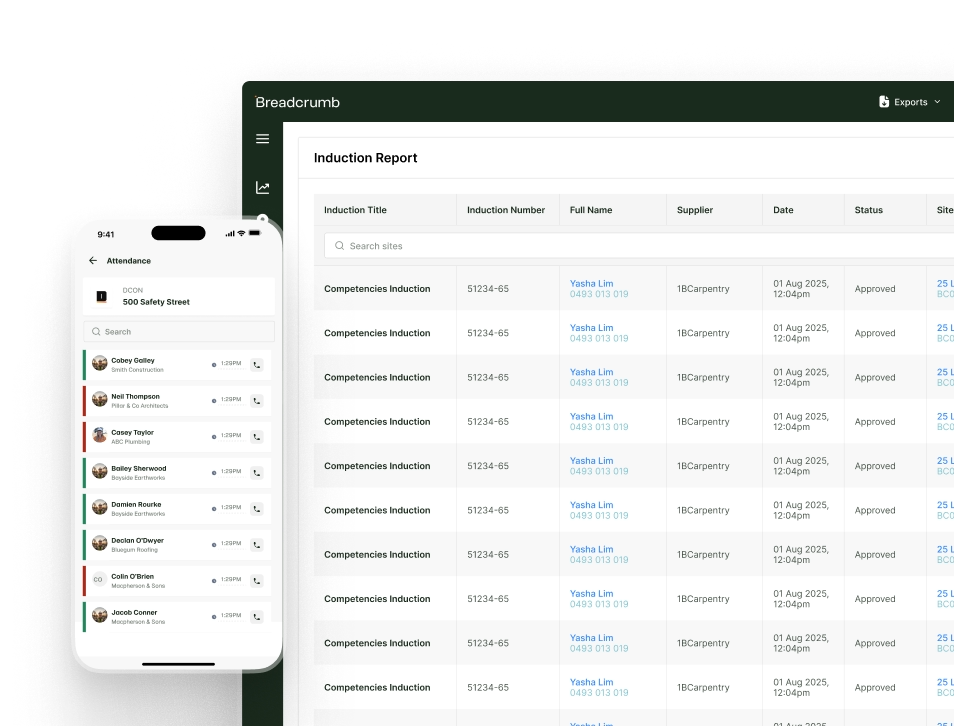
- A new website to explore the software itself and see how the tool benefits everyone from General Contractor to site worker
- How we communicate as a company and aligning this with our brand personality
- Nods to the construction site in our shapes, icons and colours
These fresh design elements will flow through into our product over the next year as we plan for the next iteration of our visual interface. It’s worth getting excited about.
Updated Brand Elements

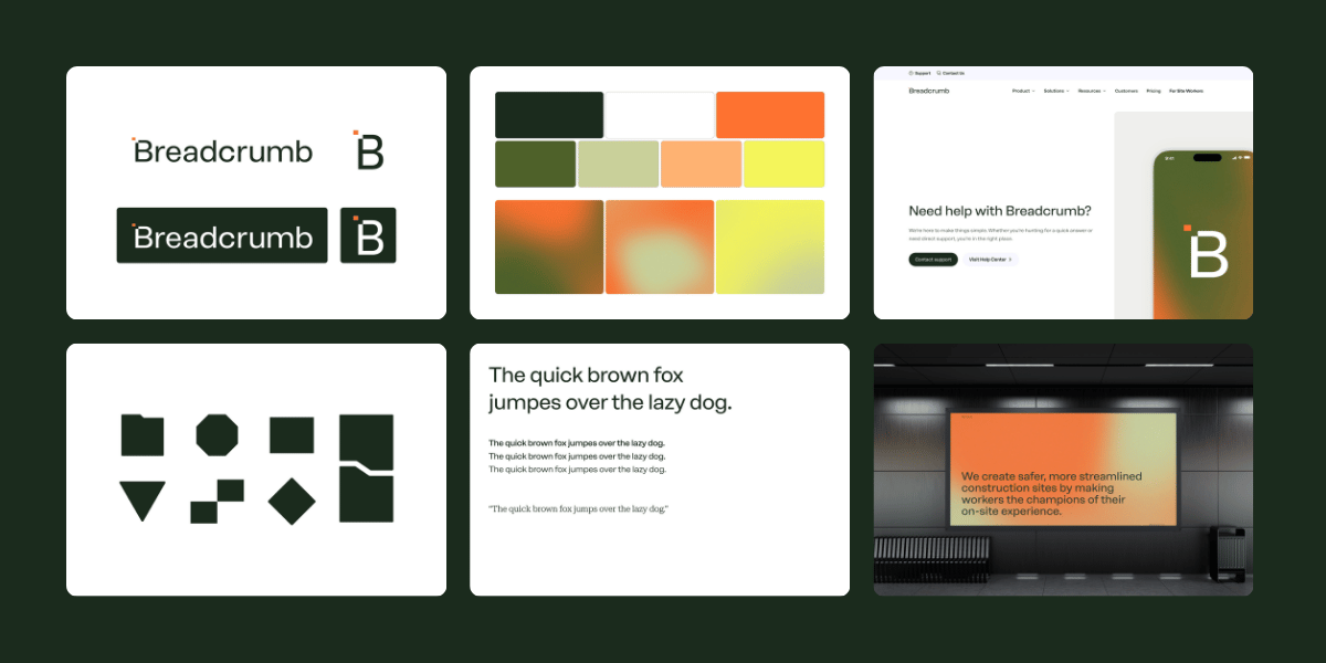
A cleaner logo: Our logo is simply our name - Breadcrumb. As an icon, it is reduced simply to a capital ‘B’ with a small orange crumb bitten out of the corner.
An imaginative colour scheme: This rebrand gave us the chance to expand our colour scheme. We’ve paired green and khaki with high-vis tones to show our groundedness and energy. Fun fact: Khaki comes from the Persian word “Khak” which means dirt/dust (kind of like construction sites). It also represents reliability and trust which are two core Breadcrumb traits. Our key orange colour is officially called ‘cone’, and we’ve introduced a range of gradients blending complementary colours together.
A nod to the site: Everything on a construction site, including the people, is surrounded by dust. Our gradients have been designed to reflect that very same movement and grit experienced on-site. These are the sort of finishing touches you get when your branding is designed by a bunch of people who have spent years completing safety forms, with dirty phone screens and dusty paperwork, getting the job done.
Graphic shapes & blocks: A nod to the more traditional methods of on-site organisation, our blocks are inspired by folders, files and paperwork. Our graphic shapes are taken from signage and materials commonly found around worksites and will be used to create moments of focus and interest.
Imagery that tells a story: The imagery we use across our website and documents are candid and documentary-style, showing what life is actually like on site, recognising the differences seen across the globe. It’s important that we show the teamwork and camaraderie that makes this industry special.
How did we announce the Breadcrumb rebrand?
Rebrands are useless if they’re not seen by the people who actually use the product.
Launching this brand was as much about the online elements (new website, updated logo, customer newsletters) as it was about the offline activity.
We took to the streets of London and Melbourne and dropped off a few hundred branded burgers to construction sites for lunch. The burgers had our logo branded into the bun - impossible to miss.
Next, we sent care packages to our loyal clients across all three regions - the US, UK, and Australia - containing fresh new merch.
To communicate the name change online, we cut the “1” off our merch and immortalised the moment through video.
Team members even took custom stencils to their favourite coffee shops and asked the barista to customise their flat whites.
What’s next for Breadcrumb?

The next phase of Breadcrumb is powered by AI and innovation.
Breadcrumb is already in the pockets of over 1 million workers globally and trusted on more than 50,000 construction projects. As adoption of the tool grows, we’re looking to find even more ways to create efficiencies and improve site safety and compliance.
Much of this will be achieved in collaboration with our customers who have a front row seat to the greatest challenges faced on site. Breadcrumb’s AI Safety Sidekick was co-created with these companies and is already having a positive impact on site, with induction reviews running 8.5x faster while retaining the same level of accuracy.
More than 65% of construction companies we speak to are still running sites manually, using stitched-together documents, siloed computer files, and paper workflows – largely because digitisation is hard and workers resist change.
We believe digital adoption only succeeds when the workforce finds the tools simple, intuitive, and genuinely useful. Breadcrumb is built for real life on site and connects everyone on a project, wherever they are.
Thank you for backing a product and team who are committed to innovation and making a real difference to the construction industry. We’re in it for the long haul.
FAQs
Why did Breadcrumb rebrand?
We’ve grown rapidly across ANZ, the UK, Ireland, and the US, and our brand no longer reflected who we had become. With new teams, new markets, and major product developments — especially the launch of our AI functionality — it was the right moment to evolve our identity. The rebrand helps us present ourselves as the unified, global safety software we are today.
Why did you drop the “1” from your name?
Most customers already referred to us simply as “Breadcrumb.” Removing the “1” makes the name cleaner, more intuitive, and more aligned with where the company is headed. It’s a simpler identity that reflects the clarity and ease we aim to bring to site safety.
What inspired the name “Breadcrumb”?
Like the Hansel and Gretel story, a breadcrumb represents the trail you leave as you move through a journey. On construction sites, each sign-in, completed induction, or safety action creates a digital “breadcrumb” that makes processes visible and keeps teams safe. Our name reflects our mission: connecting every worker and creating a trusted trail for safer, smarter worksites.
What has changed with the new brand?
We’ve introduced a cleaner name and logo, new colour palettes inspired by real worksites, a grainy visual texture reminiscent of construction dust, simplified navigation on our website while providing more context, and established a more unified brand voice across regions. These updates will carry through into our product interface over the coming year.
What’s next for Breadcrumb after the rebrand?
The next phase is driven by AI and customer-led innovation. We’re continuing to introduce new features that streamline safety processes, improve compliance, and make digital adoption simpler for workers. With more than 1 million workers already using Breadcrumb, we’re focused on expanding efficiencies and solving major safety challenges alongside our customers.

built for the field.


